RGB vs CMYK: Why Print Never Quite Matches Your Screen
You approve a design on your phone. The printed version arrives and the colours are… close, but not the same. The bright green is duller. The cream looks slightly cold. Nothing is wrong exactly, but it is not what was on the screen.
This is probably the most common confusion in all of print, and it is not a mistake by anyone. It is physics. Here is what is actually going on.
Screens make light, print reflects it
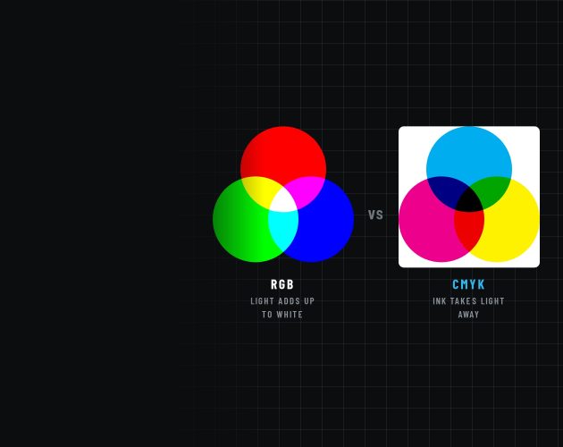
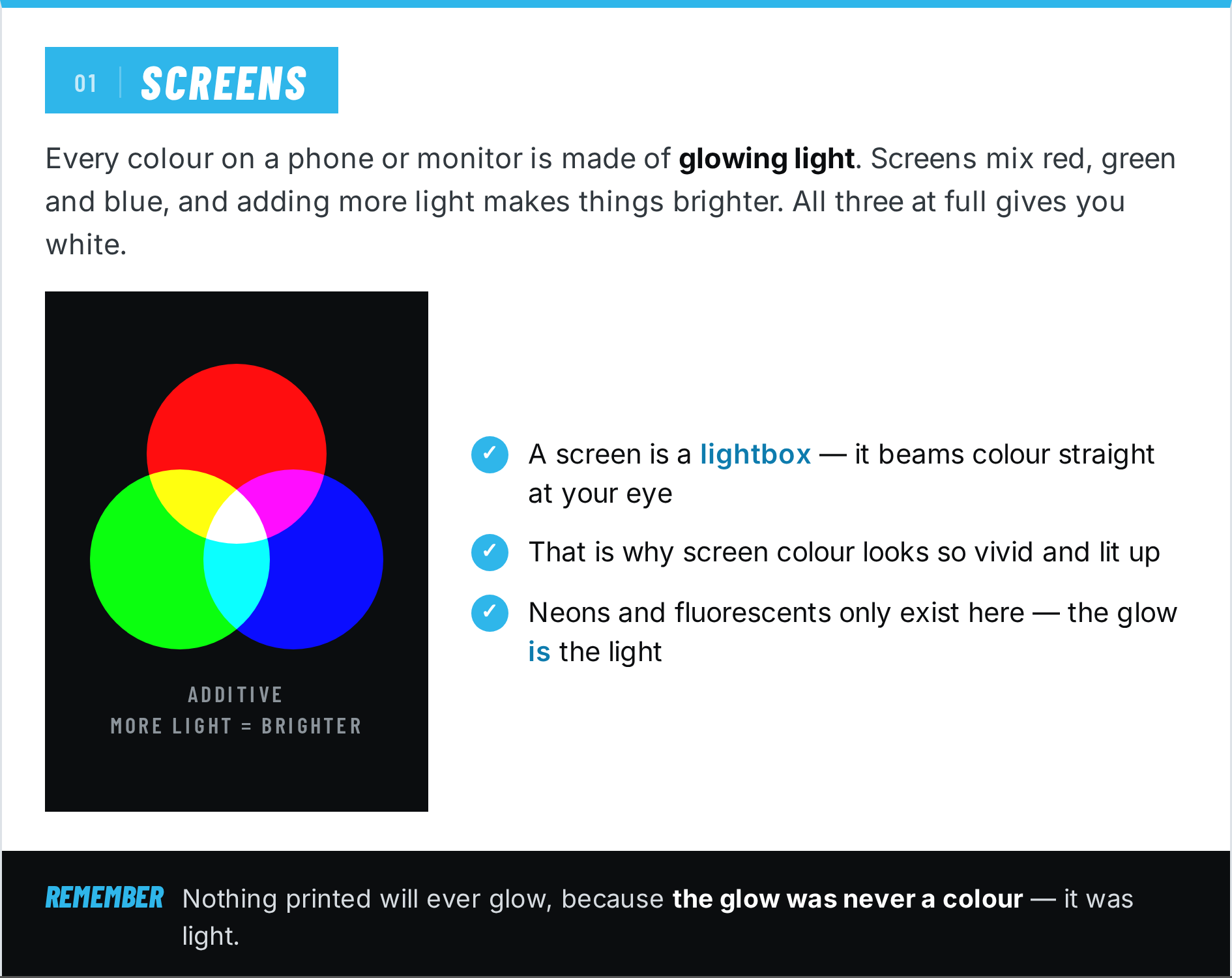
Every colour you have ever seen on a phone, monitor or TV was made from glowing light. Screens mix Red, Green and Blue (RGB), and adding more light makes things brighter. Turn all three up to full and you get white. A screen is, in effect, a lightbox: it beams colour straight into your eye, which is why screen colours look so vivid and lit up.
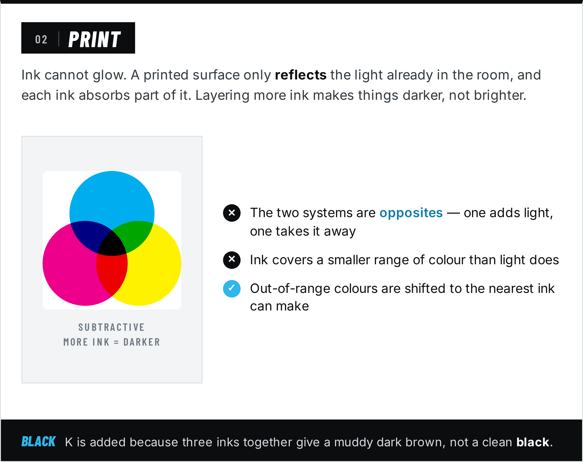
Print works the opposite way. Ink cannot glow. A printed surface only reflects the light already in the room, and the ink absorbs part of it. Printers mix Cyan, Magenta, Yellow and Black (CMYK), and layering more ink makes things darker, not brighter.
So the two systems are literally opposites. One adds light, the other takes it away. Expecting them to produce identical colour is like expecting a photograph of a sunset to warm your face.
Ink has a smaller range than light
Colour scientists call the range of colours a device can produce its gamut. The RGB gamut of a modern screen is large. The CMYK gamut of ink on a surface is meaningfully smaller, and it sits entirely inside the RGB one.
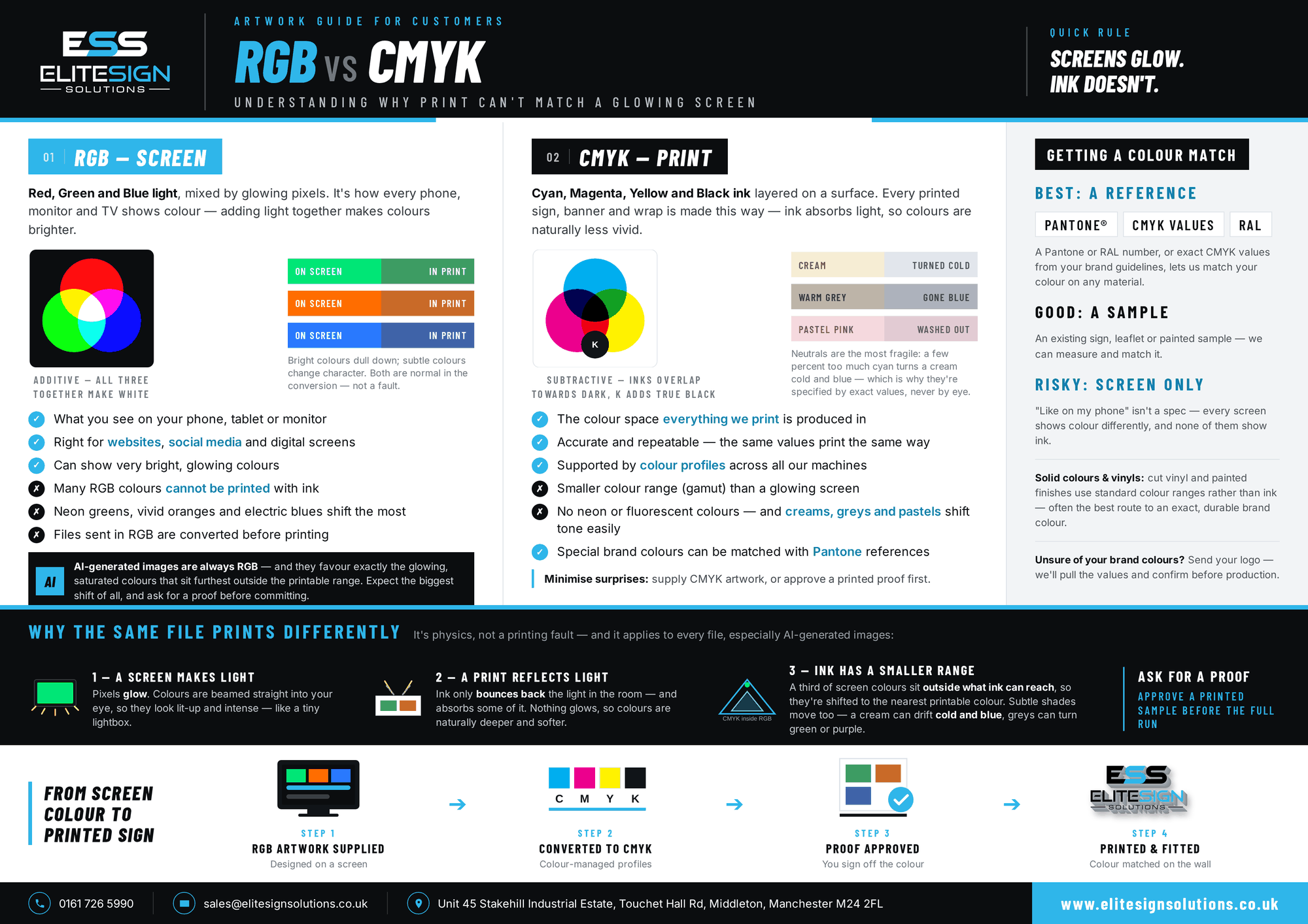
Roughly a third of the colours your screen can display have no ink equivalent at all. When a file is converted for print, those out of range colours get shifted to the nearest colour ink can actually make. The most affected are exactly the ones that look most impressive on screen: neon greens, vivid oranges, electric blues, hot pinks. Anything that seems to glow will lose that glow on paper, vinyl or board, because the glow was never a colour. It was light.
This holds true across every printed product, because they all draw on the same four inks. A PVC banner, a run of construction hoarding graphics, a vehicle wrap and a set of printed window graphics are all working from the same limited palette. If a colour is out of gamut, changing the material will not bring it back.
Why creams turn blue (and greys go strange)
Here is the counterintuitive part: it is not only the loud colours that shift. Subtle colours change character too, and people often notice these more.
Near neutral colours like creams, warm greys and pastels are the most fragile colours in print, because they are built from small amounts of several inks in delicate balance. It takes only a few percent too much cyan to drain the warmth out of a cream, and if the yellow drops away too it reads properly cold. A warm grey can lean green or purple. Soft pastels can wash out to almost nothing.
Scale makes it more obvious. A slight cast is easy to miss on a business card and impossible to miss across a full wall, which is why large flat areas of near neutral colour, such as a printed office wall graphic in a soft grey, are among the most demanding colour work there is.
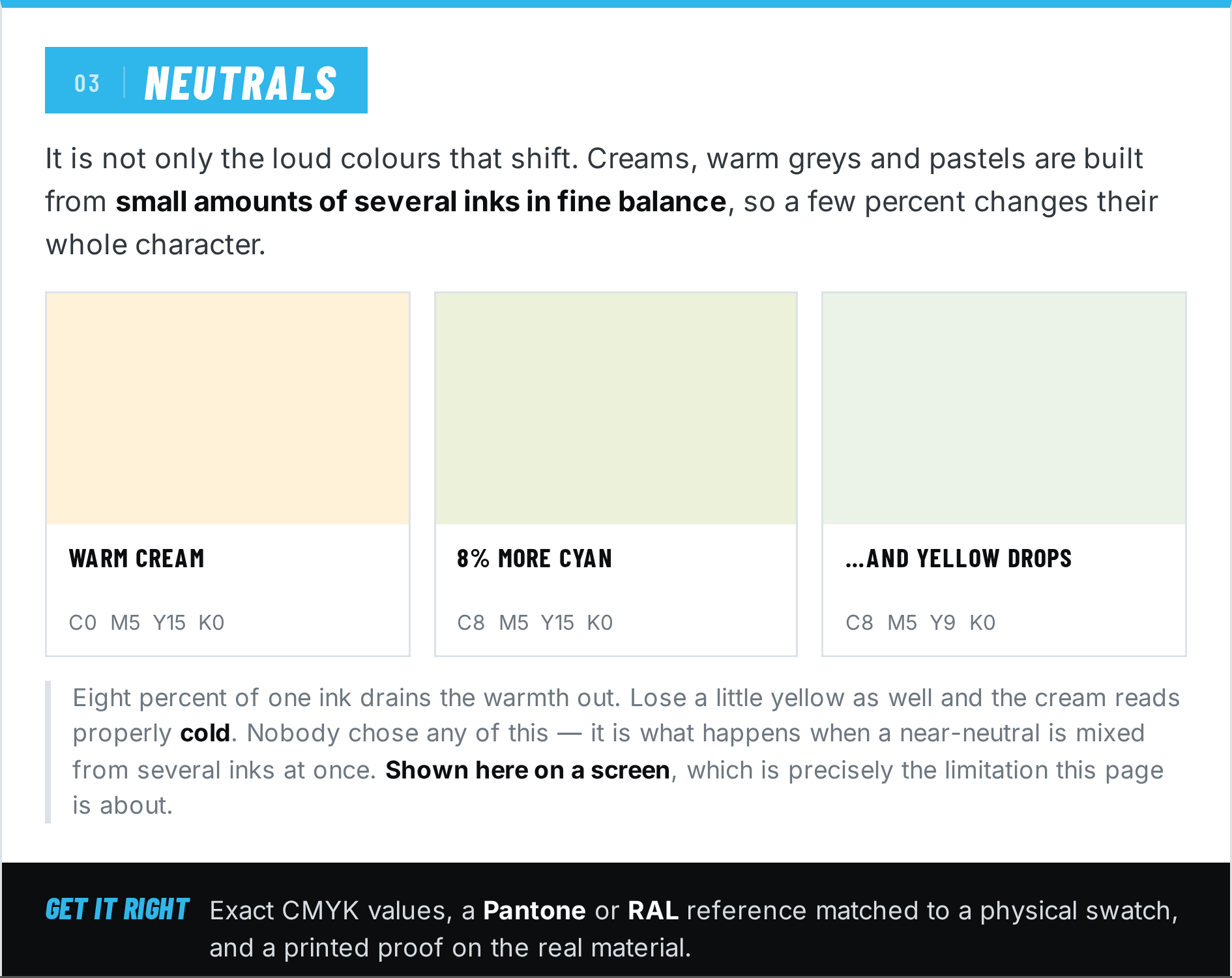
This is why professional print work specifies neutrals with exact ink values rather than judging them by eye, and why a colour that “looked fine on screen” is the classic starting point for a disappointing print.
A word on AI generated images
Images from AI generators are always created in RGB, and the tools have a strong taste for exactly the colours that suffer most in conversion: glowing gradients, saturated neons, luminous skies. An AI image is often the worst case scenario for screen to print colour shift. If a generated image is heading for print, expect the printed version to be noticeably more muted than the preview, particularly in the brightest areas.
So how does anyone get colour right?
Accurate print colour is a solved problem, it just is not solved by looking at a screen. It rests on three things:
- Working in CMYK values. A colour defined as, say, C100 M20 Y0 K10 means the same thing on any calibrated press or printer, every time. Numbers are repeatable, screens are not.
- Standard colour references. Systems like Pantone and RAL exist so that a colour can be specified once and matched anywhere in the world, against a physical swatch rather than a display.
- Printed proofs. For colour critical work, the only preview that tells the truth is real ink on the real material. A proof is a small print you approve before the full job runs.
One more useful fact: solid coloured materials come from manufactured colour ranges rather than mixed ink, which is why they can hit an exact brand colour more reliably than printing it. Cut vinyl comes in standard colour ranges, and built up 3D letters can be painted or powder coated to an exact RAL reference, which is why they are often the most colour accurate signage of all.
The takeaway
Your screen is not lying to you, but it is speaking a different language to a printer. Bright colours will settle down, neutrals can drift, and nothing printed will ever glow. None of that is a fault. Knowing it in advance is the difference between a surprise and a decision.
Elite Sign Solutions is a sign manufacturer based in Middleton, Manchester. Every printer in our workshop runs calibrated colour profiles, and we are always happy to explain what a particular colour will do in print before anything is produced.
FAQs
A screen makes colour from glowing light while print makes colour from ink that only reflects light. Roughly a third of screen colours have no ink equivalent, so in print they are shifted to the nearest colour ink can produce. It is physics rather than a printing error.
RGB is Red, Green and Blue, the three colours of light that screens mix, where adding light makes colours brighter. CMYK is Cyan, Magenta, Yellow and Key (black), the four inks used in printing, where adding ink makes colours darker.
Neon and fluorescent shades shift the most, particularly bright greens, vivid oranges, electric blues and hot pinks, because they rely on emitted light. Subtle colours also change character: creams can drift cold and blue, warm greys can lean green or purple, and pastels can wash out.
Creams and other near neutrals are built from small amounts of several inks in fine balance, so tiny variations have a visible effect. A few percent too much cyan is enough to make a warm cream look cold and blue, which is why neutrals are specified with exact ink values.
A gamut is the full range of colours a device can produce. Screens have a large RGB gamut and printed ink has a smaller CMYK gamut that sits inside it, which is why some screen colours cannot be printed.
By using numbers instead of screens: exact CMYK values, and standard references such as Pantone and RAL that are matched against physical swatches. For colour critical jobs a printed proof on the actual material is approved before the full run.